Notes for anyone coming from Creative Friday – this is mostly about photographs and what you can do with them. Feel free to skip through the pictures if you like. I was visiting my daughter in her new New Mexico home –
Okay. Running like a mad thing? (check)
Getting almost absolutely nothing done? (check)
Why? Besides the fact of business as usual? Because. Because when I sat down to work with these images, I became seduced by the technology, and by the problem solving. These pictures are still part of the Santa Fe story (why am I assuming anyone is interested in my story?), but, as you will see, there are four or five of them that took about the same number of days to deal with – hours, slaving over a hot keyboard. And I want to show them off to you, and then ask you a question.
And yes, I’ve been spreading manure and cleaning the kitchen, and finally got unpacked and bought the dirt for the parking pad and spread it with the tractor (which isn’t easy, I want you to know) and then broke the tractor and took down some fences (not with the tractor) and caught up on some of the family photo book project, and knitted some horses – and – and – I’m pretty certain there were some other things, too.
To begin: these are not the techno shots. These are a strange and happy sort of coincidence:
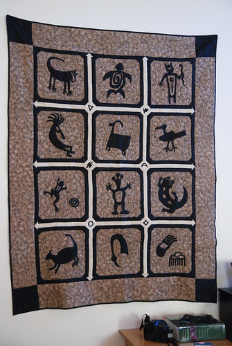
When Gin got married, I made her this quilt:
She loved petroglyphs. I’m not sure why. We never lived in that kind of country. But for some reason, she was fascinated enough, I designed this quilt (after quite a bit of research) and made it up for her. I still have some of the shapes, all ready to be made into blocks for another one of these. Wonder if I’ll ever use them? But funny, isn’t it, that this quilt, a little out of place in our wee city, turned out to be so apropos for her new life?
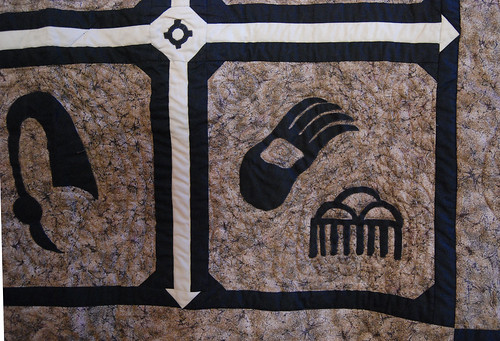
I’m kind of proud of it. The sashings were all my own idea – partly planning and partly happy accidents. Lucky to find granite flavored fabric. Her favorite part of this quilt, she told me while I was there, is this block with the rainclouds. “They really do look just like this out here,” she said. And I looked.
They do.
Yeah. I like it.
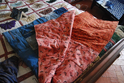
But before I did that, and many, many years ago, out of all G’s and my really cool jeans from the seventies and eighties, I made these denim quilts – one for each kid for Christmas. Half way through the year, we had a family home evening, and I hauled out the thousands of blocks I’d cut from those wide-legged things – some with seams, some with pockets, some plain – all different shades of denim – and the kids got to choose their blocks and stick them together with pins – artistically suited to each taste.
Then I sewed them together, picked the perfect backing, bundled them up and took them to my local quilting store to be done up on the long-arm. And – well – my quilts broke the machine. Long-arms, it turns out, don’t really like sewing over jeans seams.
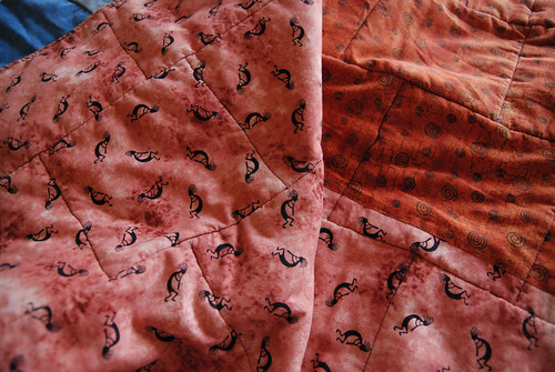
The point is, look at the fabric I chose for Gin, even back then:
IT MATCHES HER BACKYARD.
Okay. So that is the first fun thing. Now comes the second: Image manipulation.
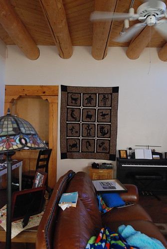
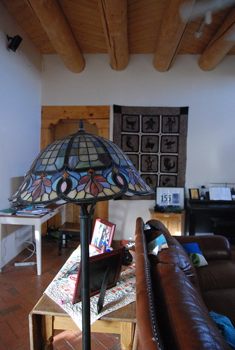
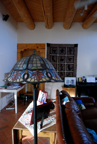
Gin got this beautiful lamp for her wedding from one of her almost-uncles (if he ever read this blog, he’d know who he was). In the move, the top of the lap got a little bent, so the shade is hanging a little skiddy-wompus. I noticed this as I was shooting the room. And immediately was suffused with the sort of warm thrill that comes with the thought of fixing the world.
What I did was, I took the lamp shade completely out of the shot, repaired the back ground, then straightened up the shade and put it back on again. If you look at these three images pretty quickly, one after another, you can kind of make the lamp dance:
Well. No, you can’t. Dang. If you’re running through them sideways, you can. Anyway. I felt really good about that. And it whetted my ambitions –
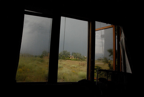
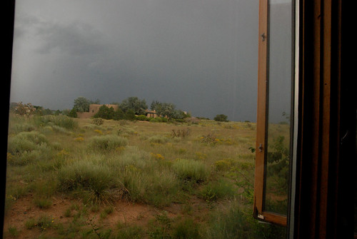
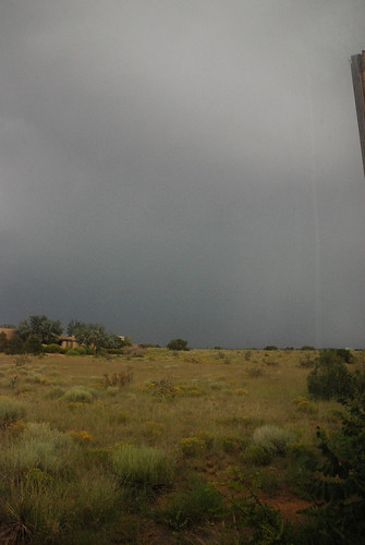
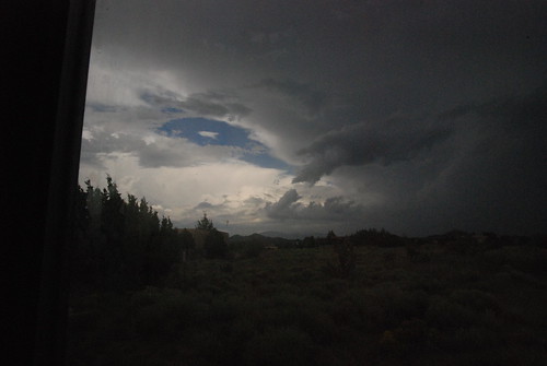
We had a rain storm. Well, we had several, but this one happened at a quiet time when I was lying on the bed in my guest room with all the windows open to the wind. The sage smelled so incredible as the rain hit it – and the wet desert was fresh and wild. So I took several shots to share with you the view from my window, even though you won’t smell a thing:
The spaces. The sky. The wet wind.
These windows are pretty much on ground level. And you have to sleep with them open in the summer or die. Do you know how SCARY that is? It’s totally dark out there in the wilderness at night – and how are you supposed to know who – or WHAT – might be peering in from the wrong side of the screen? Like Big Foot? Or coyotes? Or mad Kachinas?
Or even Irish – what are they called, those mischievous black demon horses . . .
And the sky ended up looking like this. By this time, I was ready to go find the fam, and found M outside, perched on the low stucco wall of the back yard (garden, really).
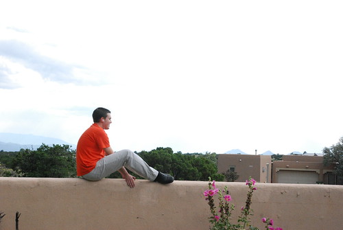
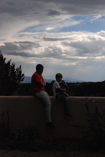
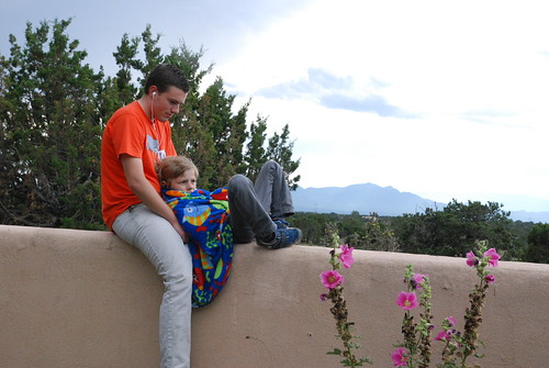
He was talking on his iPhone. To a girl. Through earphones I believe to be mine. (Yeah – are they mine? Huh?) But the picture I saw (besides the utter loveliness of my son) was so dramatic and amazing, I had to shoot it. And I kept shooting it and kept shooting it over and over (as you will see – and you will only see a fraction of what I could have thrown at you) as the light and the players changed.
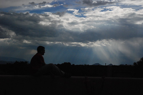
HOWEVER. Under this kind of lighting condition – with a camera that can compensate for a dark subject – I could not capture exactly what my eyes were able to see. To shoot so that M would be clear in the picture meant that I would miss capturing the sky (overexposing it), while to shoot the sky meant losing the boy (underexposing him).
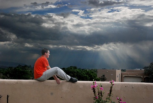
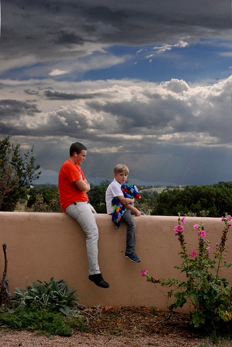
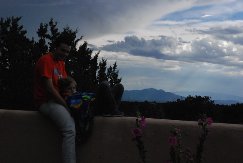
As you see. He is underexposed to the point of being a silhouette. To be frank, unless you are terribly taken by M in his orange shirt or by the details of garden and wall, there’s not a whole lotta drama in that top shot. But in this one, the sky – the blessed storm sky – is all drama. So I shot each of these things – the light and the dark – with, once more, the intention of fixing the world. I wanted to make an image that would show you what my own eyes had seen.
I knew there were ways to do this, because I’d done some little things like this before. I just had no idea how much I was about to learn on the way to doing it.
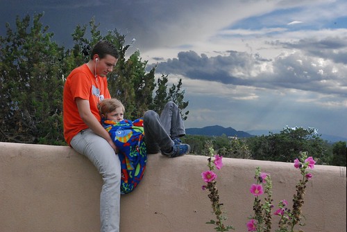
And this was the result. This is pretty much what I saw. Both boy and sky together. The lighting on him is wrong – and I should have shadowed the near side of him up quite a bit. But really, there was light coming from behind me, too. The edges are the tricky part. Preserving the details without making the edge sharp and harsh.
So this is the dark shot.
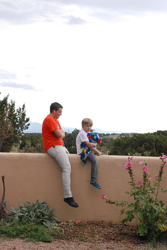
Then Max came out and joined his uncle, and I had to shoot more. Same problem. What I had to do, once I was back at my alchemist’s lab of a desk, was figure out how to make a mask that would preserve the delicate details of the foreground, but allow the sky to come through – and compensate for the different positions of the people in the two shots. Because I don’t hold still enough to have two shots that align perfectly. (You can see how different the shots are by comparing the position of the flowers on the bottom right side of each shot.)
If you scroll up, you’ll see how the figures are in slightly different places than in the light shot. I tell you what – the Photoshop content aware fill really helped in some of these situations.
And here is the composite. Again, far closer to what my eyes actually saw. If you want, I can actually show you how I did it. But I think maybe that would bore most of you pretty much to death, and the others of you are professionals and could have done it in about twelve less hours than it took me.
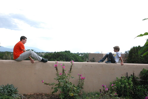
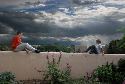
I had no dark shot for this one, so I borrowed some sky from another shot altogether.
In this one, I faded M out a little more to match the grayish mood.
The dark shot.
This is the one that just killed me. It’s very hard to make a mask for intricate things like hair and foliage. For this one, I tried quite a few different techniques. I started with a fairly simple mask that started with dividing the front image into color channels and choosing the one that showed the most contrast. The problem is that a mask is never perfect because the selection tools are not perfect (or you don’t have five years to select every perfect pixel), and when you contract or expand your selection, you lose detail. (Are you following here? Sure you are.).
Add to that the fact that the two images, light and dark, are offset because my shooting angle changed just enough that the dark shot is higher than the light shot, and the tops of the dark foliage weren’t hidden by the mask. So here are several tries, and here is where I ask the question:
As you look at the following four composits, just looking at them the way you’d buzz through most of my shots, do you see a lot of difference to them? But when you look closer, do you begin to see problems and differences? And in the end, which one do you think worked the best? I ask these things because I’m trying to learn what is important when you are doing this work, and what is not. One of my quilting friend’s mothers used to say, “You’ll never see that from the back of a running horse.” But as the person who is doing the work, I see very flaw.
Thank you for getting this far. I know that sometimes, things that fascinate me are really not that interesting to anybody else in the world. But I’d really like to show you the rest of the story, if you don’t mind? If so –
Okay. A week later, and I took one more look at the last composite. Here is what I ended up with:
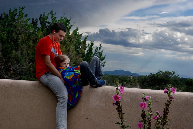 Much better, because the light on those two lovely creatures is far more subdued, and there is shadowing on the back side of them. Far more likely a lighting situation. What’s fun is that this is almost like painting. I start with a technical image and then brush a little here, a little there – a mixed media expression of something I love. So YAY!!
to be continued . . .




23 Responses to ~o:> Slight Distractions