Autumn has blown. I am so sad. Every year, there comes a day when the yellow ceases to be yellow, a change in the intensity of life, a collapse. It happened this morning. Yesterday the yard was burning. Today, after the frost of last night – well, it’s just gone. Which is weird, because there are still so many green leaves out back. I don’t understand it.
This morning on the radio, I heard people taking the Wrangler Jeans pledge. It seems that one of the Wrangler factory/distribution locations, a place in Alabama, had been destroyed in the terrible tornadoes of this last season, 26 people killed. Jeans carried and dropped ninety miles away. But the company, even in these rough economic times, didn’t just fold and walk away from the loss. They stated that they had good people down there, and that they believed in their people. They are re-building and expanding the facility. Not only that, but they have temporary digs while that happens, making sure that their people stay employed with benefits. And adding fifty new jobs.
I would say that this is the spirit of America. But that would be – so short sighted. This is the true human spirit. I see it, personally, in South Africa, in Australia, in Canada, in Japan, in South America – where people love and take responsibility and stay true – everywhere. Everywhere we are are truly, nobly human. And I will add—truly, nobly the children of a God who loves. So I’m going to buy a pair of Wrangler jeans – to make sure that not-money-grubbing corporation is supported. Hurray for those who stand for life.
Okay – so I showed you a few of those basic image elements yesterday. The trick now was to integrate them. Again, remember that I’m just trying to ascertain whether my concept was at all viable.
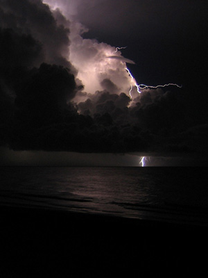
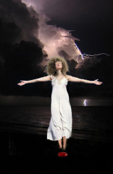
I started with this shot of the beach storm. It really hit me.
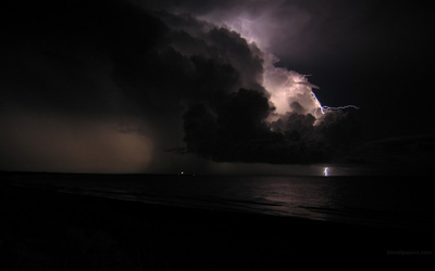
But for the Kindle format, I had to use a piece 600px by 800 px. So I cropped it to this:
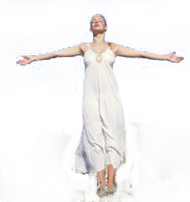
Now, I went permission hunting – and that’s when I found that I’ll never find this photographer so I could ask. So I took great care to make sure I had permissions before I did anything else. Next, I took the isolated figure of the woman and superimposed her. I didn’t save my Photoshop files, so I can’t build this piece by piece for you. I was trying to hurry, and considering how long this took, I needed to.
I needed hair. So I added the wild hair I showed you yesterday, and cobbled up a piece of red glass, and this is what I got:
At that point, I realized that I had not actually made the thing to the correct size, and I re-sized it. And ran my watercolor treatment on it, adding texture, blurring edges, adding bits of sketch lines (this was not invented by me) and taking the whole thing down to 300 dpi – which may end up biting me hard as I try to set up the file for Amazon.
(Digression: dpi means “dots per inch” and has nothing much to do with how something looks on your computer screen. Your screen shows you things in pixels, a fixed unit for your screen more or less – but in PRINT on paper, dpi literally dictates how many dots will be printed per inch of paper. This means that if you save something that’s 72 dpi, it will be printed only 72 dots in each inch. If you save a file at 72 dpi, figuring it will be a certain size in inches once printed on paper, that exact same file saved at 300 dpi (looking the same on your screen) will be printed with 300 of those dots per inch on the paper—so it will come out four times SMALLER that the 72 dpi one did on paper. Does this make sense?)
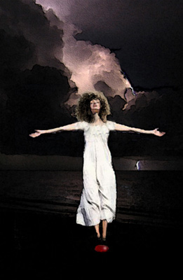
At this point, I changed the dress, giving it a different bodice and some Greek urn sleeves.
Then I added some titles:
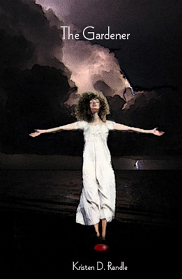
Okay. The problem is that, while the concept really did work for me, this mock-up didn’t. I had to get permissions for one thing, and while I—being basically a storyteller and once an English major—could make up all kinds of symbolic malarky in my own mind about how this cover could work for the story even though there were no grown women in white dresses in it—well, there weren’t any.
The story is about a young girl who is much like all my protagonists: not all that sure of her self. A tee-shirt wearing, puzzled-by-life, fuzzy-haired blond (hey – that’s Me) who takes on a situation and works through it. Hmmm. I wonder what would happen if I someday should try to write a brunette? A whole new world.
So once the concept had proved itself good to me, I had to do it for real. Which meant I had to find a model and shoot stuff of her very quickly, because I WANT THIS DONE. In fact, I just realized last night that the climax of this book happens on Halloween – I have MISSED the boat here, unless by miracle Tracy gets that set up done in the next two days.
Anyway, so I found a model and Guy shot a bunch of frames of her – she was standing on a stool in front of a blue sheet tacked to the front of my house. The blue sheet was because—if I’m going to isolate an element in a photograph, it’s a thousand times easier if the background is a uniform color. And then I had to choose a beach shot that I had permission to use. I’d written Robert and the Jones-guys so I could use their stuff. So I started with Robert’s and came up with this:
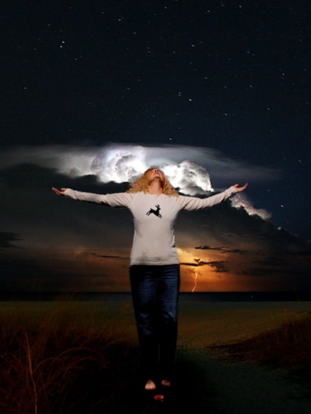
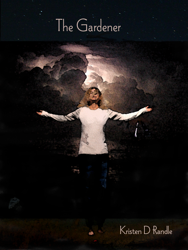
New beach. Robert’s clouds were lower and more horizontal and his sky and beach more colorful. I added the deer because that’s dang symbolic in the story. However, when I showed this to my kibitzing family, I was told that the body was too full grown woman and the deer was A) too loud and B) made the tee shirt look like something you’d buy at Christopher and Banks, a store that caters to middle aged people, not young people.
But the deer had to stay, so he became hipper by going shadowy and entering on the side of the shirt. And the body got taller. more leggy, thinner – and lost hip. But I got very insecure at this point and said, “Okay – maybe we need that other head?”
No. We did not need the other head.

More hair was added to this person to give energy and lift to the image. But a couple of things happened here. I sent this on a whim to a new friend in Australia, thinking I had it now – and she wrote back and said that she probably wouldn’t read a book with this cover; she wasn’t really into religious books. Which this obviously was because the girl was an angel with those cloud wings coming off her back
Well, now. She had out-symboled me. Because this is not a religious book, and this protagonist, while she is a very good girl is not an angel. So I had problems there. And then G said, “Nice. But this doesn’t look like a beach.”
“Are you kidding me?” I said. “Look at the beach grass and the water and everything.”
But Ginna said, “I know eastern beaches, and this doesn’t look like a beach. And besides, the girl’s head is at a very uncomfortable angle and all you can see are nostrils. Nostrils instead of eyes. And with the first mock-up, the dress gave you the feeling of wind and made the storm feel dynamic. There’s no wind here. But otherwise, you know—it’s cool.”
So I had to nuke the angel effect, crank up the beach and do away with the nostrils. And re-intruduce the wind, which is not easy when you’re working with a tee shirt instead of a flowing white ethereal dress.
All of this meant choosing a new background and re-shooting the model—this time with a fan blowing. The fan part made me feel very Hollywood.
So we changed beaches. This time, the water was clearly evident. But I’d lost the nice beach under her feet. And I was going to have to find lightening, because the lightning was important. So I chose this shot of the Jones crew’s.
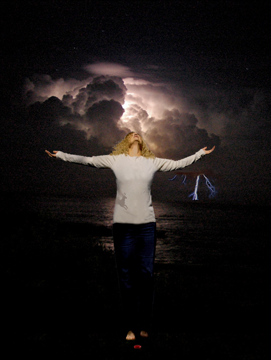
Took out the red tints to bring it back to the original background’s almost black and white range. Added lightning.
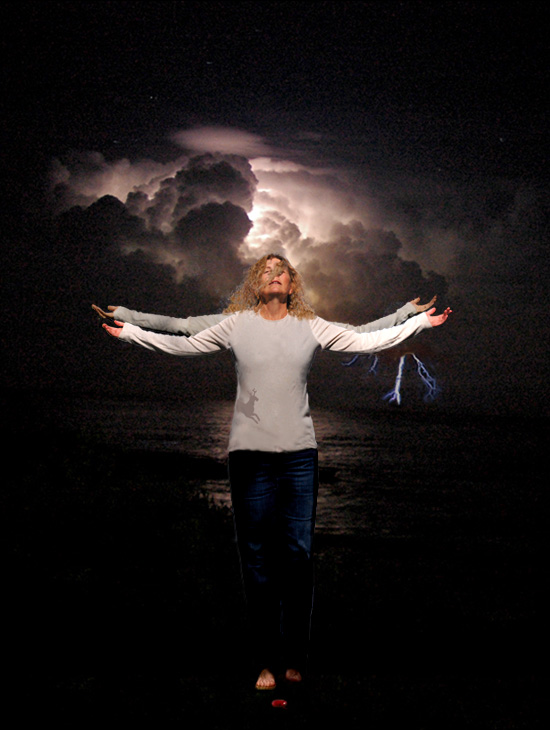
Reshot the model – with fan. And lowered the arms, because without the old head angle, the shoulders were unnaturally high. So here is the new figure superimposed on the old one. This is how I combined them. I reduced the opacity of the new image so that it was almost transparent. That way I could see the lines of the old image through it. That way, I could ascertain that the two images were lined up right. And then I simply erased the old arms where they didn’t match up. YAY!!
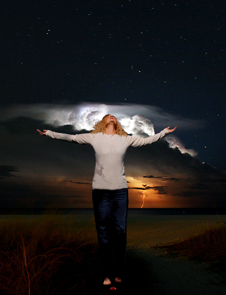
Now, I had a new figure. Had to tweak the the color – the lighting conditions had not been the same on both photo sessions. And I liked the face. Except I needed to add more hair to give a little bulk and put a few more strands across the face. But I wasn’t happy with the beach. So I took Robert’s foreground and added that in, and I also took his starry sky and put it above the clouds. That way, I had pretty much everything I’d wanted. The figure is supposed to be standing in the wind, loving it – the suggestion of praise in the arms was good, but not overwhelming – there was wind in the hair across the face.
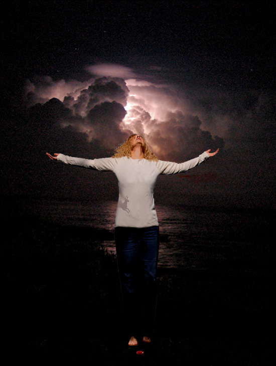
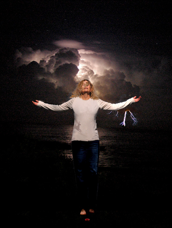
See? That bit of reddish beach is there on the bottom, and the stars at the top. But I didn’t like the face yet. So I turned the corners of the mouth up a little, and that changed everything.
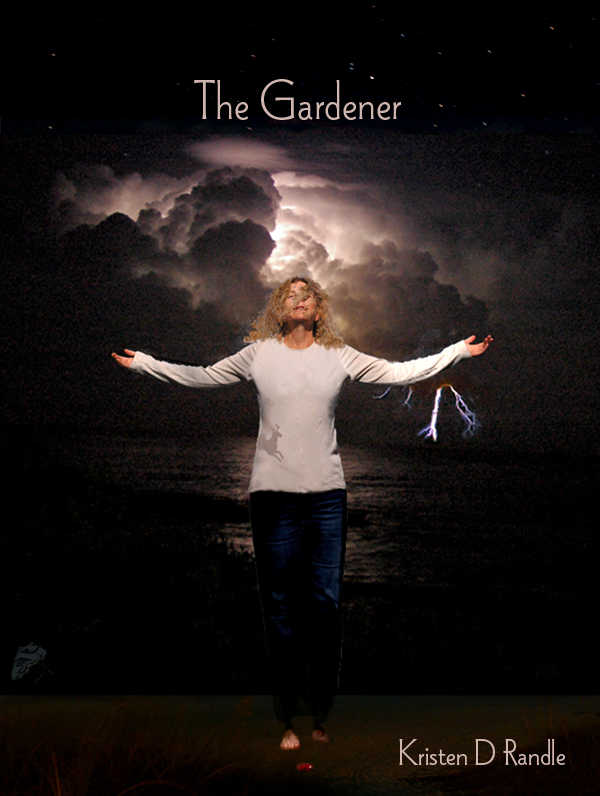
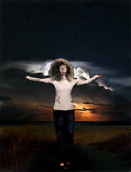
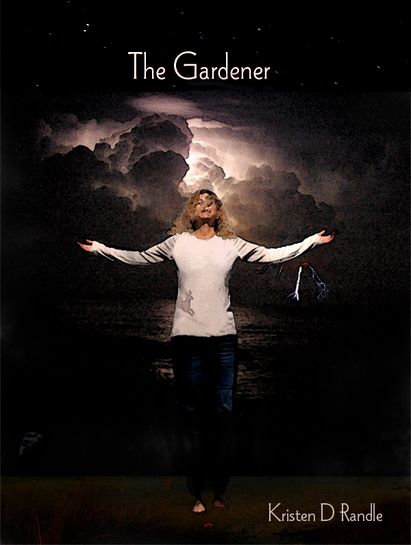
And then added titles and a few more wisps of hair across the face. I love the font “Wade Sans Light.” They used it on the Alien, and I have used it since. And there it is. The finished deal. Except, as I was writing this thing, I realized, to my amazement, that I had forgotten to run the watercolor treatment on this one. So I did it just now.
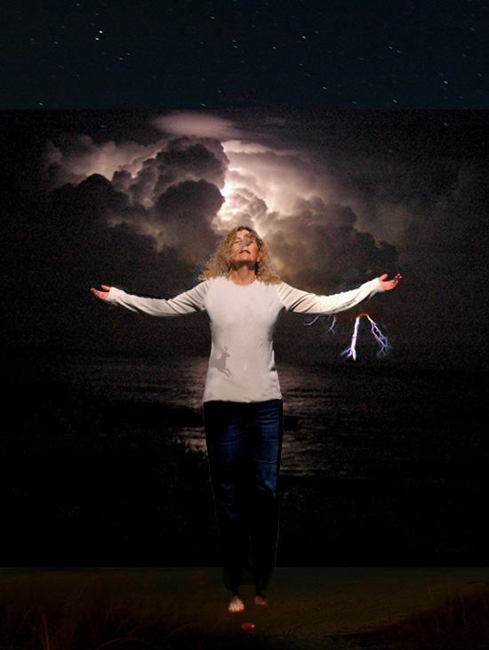
But wait. Detail missing. Trying again.
And so I end with a very important question: which one? Water color or plain? I have to know before Tracy finishes the set up. Which might be ten minutes from now, or maybe two months from now, but I gotta know – which one? Cover number 1 just plain? Or Cover number two: Watercolor? Or Cover number 3 BETTER watercolor??
Help, help, help!!!!

23 Responses to ~:: Cover Story: Middle and End ::~