I am not dead. But I’m tired. Rachel and I, both of us fairly worn out, rode the horses today—rode them down to the elementary school so we could be props in Ms. K’s assigned mini-lecture to her – what – fifth grade? – class. Z was the teacher and has promised me pictures of us, sitting magically up in the air on tall beasts, there in the parking lot. It was really kind of wonderful, mounted and riding into the chill of the autumn afternoon, riding past pumpkin fields and corn fields—yeah. Good for the soul.
I thought you might like to know what’s been sucking up my time like an $800 vacuum these last two weeks. It stems from a terrible leap – a hard decision I finally made with the help of Tracy and Laura, fellow writers and excellent friends. After waiting for over two years for a decision on the publishing of The Gardener, I have taken the book back from Scholastic (sorry, because I really liked the editor). I’m going to publish it myself as an Amazon e-book.
The point of my writing was never Getting Rich. I write to be read. So frustrating to be silenced by attrition. One agent once complained that my books are so “quiet.” No vampires. Nobody dies. No car chases. No explosions. Edginess is not the defining characteristic of my writing. I write about people.
Two things have kept me dithering over this for the past year: I don’t love e-books. I love print books. But print is gaspingly expensive; to get a decent unit price, you have to buy enough books, you could build a house out of them. Still, people read ebooks. More every day. So why not? I can always print a book or two for myself on-demand.
And the second thing: even with an e-book, you have to have cover art. Cover art. Art. When you have a publisher, THEY find the artist. They pay for the cover. But you know, when I come out of my little curled-up-in-the-corner worry, I remember that, out of my three New York published books – well, six, if you count hardback covers and paperback ones – I have hated over half the covers that ended up pasted on my stories. So what the hey? I made the plunge. Still – how, how, how to get a cover.
Enter that seam between sleep and waking—that place were sometimes inspiration kind of shakes itself awake and plants ideas in your head. Two weeks ago, in the midst of tossing and turning over a mess of things, I dreamed the cover concept. It just popped in. I needed the beach and the girl and a couple of other things significant to the plot. And it occurred to me that, even though I am no artist, I am pretty good with Photoshop. I just needed to know how to start. Like, I needed a photograph of somebody to start with.
I called Cam – he’s the guy with the lights and the green screen. But he’s on a deadline. “Do a concept work-up,” he said. And that was the start of it. A concept work-up actually sounded like fun. So I got on Google, and I started looking for images – something that spoke the concept. And I collected a bunch of things, downloading and sticking them in a folder. At that point, I wasn’t worrying about copyrights. I’m going to show you some of the stuff I found – most I have permission to reprint, but I think just re-posting isn’t a problem anyway if it’s in a blog and there’s credit given.
I started with beach pictures:
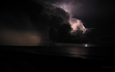
This is the first one I found, and the one I loved best. I found it on a wallpaper site. And joined the site and downloaded the image – but the person who had uploaded it in 2009, her email address wasn’t functional anymore. So I couldn’t get permission to use it. It might not even be her shot to begin with. But it was beautiful.

This one was taken by a private photographer (and really nice guy), Robert D. Bruce, who has given permission.
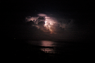
This one belongs to an Australian coffee shop – cool dudes – Mister Jones Open Studio and espresso bar. Permission granted.
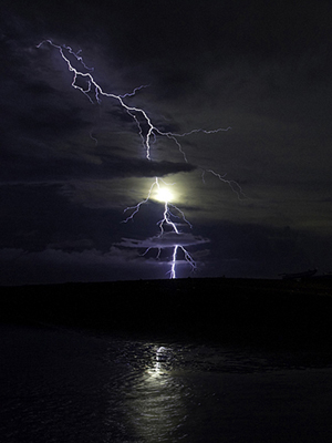
And this one? I don’t remember who shot it. Dang.
Then I had to look for the center piece: the picture in my head was our heroine, standing on the beach in the terrible storm, her arms flung out, her head back – hair blowing. With a couple of other symbols thrown in. I wanted a cover that would compete with the present spate of mostly black covers, but not be like them at all.
So I found shots of women with their faces to the sky and arms out to the wind. But the only one that was full body was this one, that belongs to the Getty group.

Then I had to isolate her figure.

This looks fairly awful, but it was for a mock up and I couldn’t take the time to make it perfect. I was going to do a watercolor treatment on the entire composite, so I wasn’t over concerned about exactitude of detail.
Now, understand that there were a couple of problems with this figure. 1) There is no woman in a white dress in the book. 2) I wanted WAY more hair for my mock-up. Any time you work up a concept you run the risk of everyone falling in love with the mock-up, when the final product is going to be WAY different. So do NOT get stuck on what I’m showing you here. It was only an effort to see if my idea had merit.

This shot came from a hair salon. The face was not what I wanted.
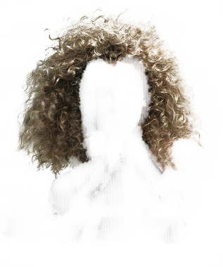
But the hair was fun. So I harvested that.

And I needed a piece of red, rounded glass.
So—and keep in mind, please, that even finding these things was the work of hours. And the putting together of them? Ah, the time. But I was so focussed on doing it, I didn’t realize that days had gone by.
Okay, I think I’m going to quit here as this has become quite long. I’d like to show you the rest, but only if anybody’s kind of interested to see how it turned out. So let me know –


21 Responses to ~:: Cover Story ::~